← back to work
E-commerce Platform Luxury Fashion

chloé: richemont’s shared-platform pilot

Redesigning chloé.com as the first brand onboarded to a shared UI pattern library other Richemont houses would build on next.

RoleProduct Designer, one of three on the project
ClientChloé, French luxury fashion house
Team3 Product Designers · Delivery Managers · Farfetch Optimisation · Chloé stakeholders
TimelineMay 2023 to June 2024

This project is subject to an NDA: some details are generalized rather than disclosed at client-specific level.

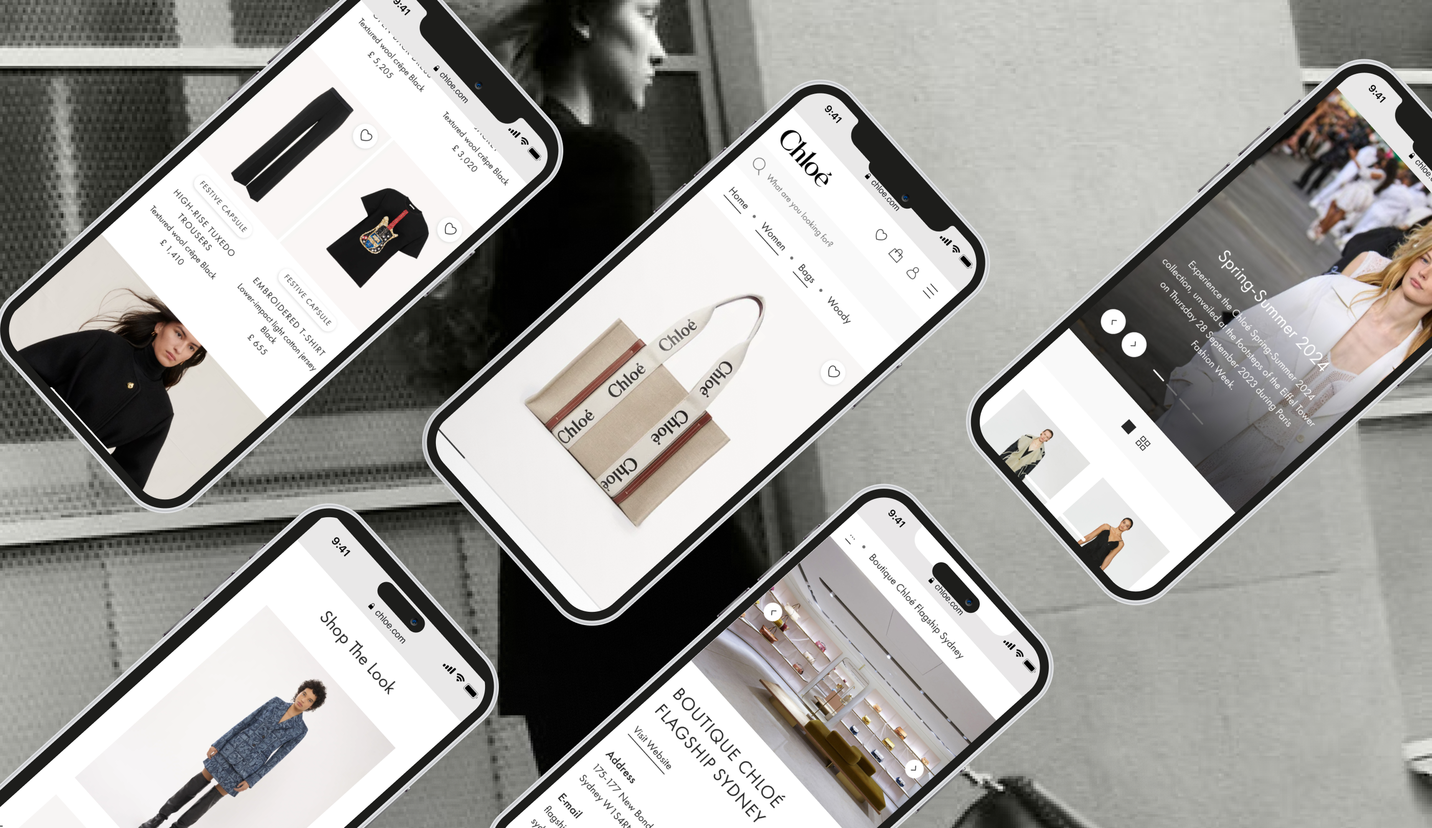
Chloé e-commerce app screens: product pages, bags, and boutique details

Overview

The short version, for anyone reading on the way into a meeting.

Chloé needed its e-commerce experience to feel as considered as its physical boutiques, without a rebuild, on a platform shared with three other luxury houses. As one of three product designers on the engagement, I helped drive a UX-research-driven redesign of search, discovery, and account experience inside a deliberately narrow 70/30 scope split, adapting our existing UI kit into a new component-led style guide aligned to Chloé’s brand identity.
70/30Scope split: redesigned vs. untouched
3Sequential design batches
6Unmoderated usability tests, US/UK
4Business metrics targeted
3Other luxury brands on the shared platform
What we were solving for
Search & discovery engagement PDP → purchase conversion Account & retention friction Accessibility & sustainability compliance
Key trade-offs navigated
70/30 scope constraint Shared platform limits Brand instinct vs. research
“If I ran this again, I’d define north-star metrics and get instrumentation agreed at kickoff, not after batch one shipped.” What I’d do differently. The full reasoning is in the detail below.
Read on for the full story
01The Business Challenge

Chloé needed its e-commerce experience to catch up to its brand: a digital flagship that felt as considered as the maison’s physical boutiques, built on top of a platform shared across multiple luxury houses. That constraint shaped everything. The site couldn’t be rebuilt from scratch, and any redesign had to prove its value within a platform designed to serve several brands at once, not just one.

Going in, the redesign was framed around four things the business needed to move:

  • Search and discovery engagement. Getting customers from intent to product faster, with less friction.
  • Conversion from product page to purchase. Reducing hesitation and drop-off between PDP and checkout.
  • Account and retention friction. Making login, registration, and order management simple enough to support repeat purchase.
  • Accessibility and sustainability compliance. Meeting WCAG guidelines and a new environmental content policy, both increasingly non-negotiable for a brand of Chloé’s standing.

The strategy the team landed on was deliberately conservative: a 70/30 approach, where 70% of the existing site stayed untouched and only 30% would be redesigned. That number became the single biggest constraint on every decision that followed.

02My Role & Approach

I worked as one of three product designers on this engagement, sharing ownership of optimisation and user-centric redesign across the site’s core journeys. Together we translated UX research into design decisions, built and maintained Chloé’s component-led design system, and represented design in weekly syncs with Chloé stakeholders, where scope, trade-offs, and direction were negotiated in real time rather than decided in isolation.

The work was structured into three sequential design batches, each ending in a stakeholder checkpoint. That cadence mattered. Nothing shipped without client sign-off, but it also meant the pace of iteration was set by alignment meetings, not just by how fast the design work itself was maturing.

The three-designer team and the three sequential design batches
03Research & Insights

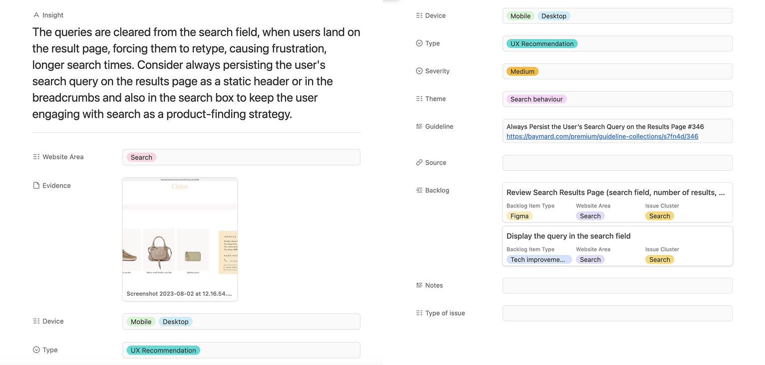
Before redesigning anything, I helped run two parallel research tracks: a UX review benchmarking Chloé’s existing pages against industry best practice (including established heuristics like Baymard’s guidelines), and unmoderated usability testing with six sessions across US and UK users, on both desktop and mobile.

The clearest, most costly finding: search queries were cleared the moment a user landed on the results page, forcing them to retype and re-search from scratch. It’s a small interaction detail with an outsized cost. Every instance of it was a customer re-doing work the system should have remembered, right at the moment they were closest to finding what they came for.

That finding, alongside others around navigation clarity, footer structure, and product-page scannability, became the backlog the three design batches were built to work through.

Usability testing findings summary
04Key Decisions & Trade-offs

A few tensions shaped this work more than any single design choice did.

The 70/30 scope constraint

Only three-tenths of the site could change. That meant constantly triaging which UX issues were worth spending redesign budget on, and which ones we knowingly left unresolved because they lived in the 70% we couldn’t touch. Prioritization wasn’t a one-time exercise. It was a running negotiation across all three batches.

Building on a shared platform

Chloé’s site sat on the same underlying platform as Cartier, Chanel, and Richemont. Every customization had to work within that shared foundation, which meant Chloé-specific ambition sometimes had to be scaled back to what the platform could reasonably support without diverging too far from the other brands it served.

Brand instinct versus research

Chloé’s stakeholders had strong, well-earned convictions about brand identity, and the styleguide shift from beige rosé to black is the clearest example. Part of my role was holding the line on what user testing and the UX review actually showed, while still respecting that brand equity is a legitimate design input, not just an obstacle to user-centered design. That balance was negotiated, not won outright, in most of our weekly syncs.

05The Solution

The redesign clustered into three journeys: Discovery (styleguide, navigation, header, footer, homepage, search, PLP, PDP), Purchase (login, account, bag, checkout, orders, returns), and Content (editorial, newsletter, legal, store locator), each reviewed against both the research findings and Chloé’s business requirements.

Two pieces of work anchored the rest.

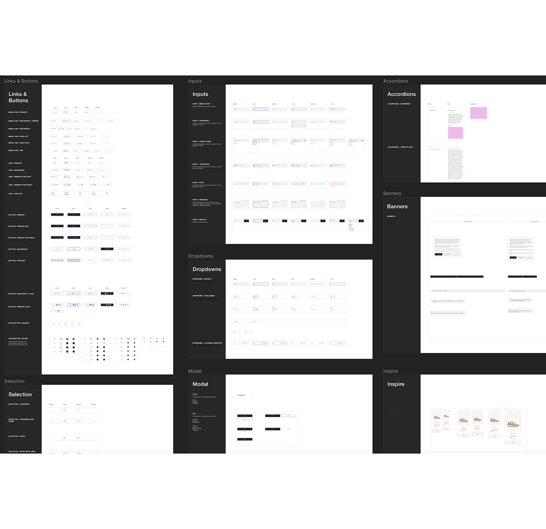
Rather than starting from a blank canvas, our team took our existing UI kit as a foundation and enhanced it to align with Chloé’s style guide and brand identity: buttons, inputs, dropdowns, modals, accordions, banners. This meant every subsequent redesign decision inherited consistency and accessibility by default, instead of needing to be re-litigated page by page. I focused on designing several of the more intricate components while meticulously assessing accessibility guidelines, so the system stayed inclusive as it scaled.

Component-led design system: buttons, inputs, dropdowns, modals, accordions, banners

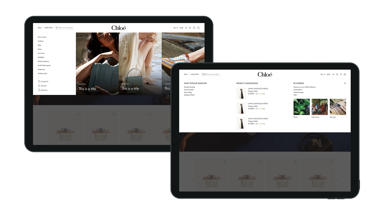
The search and navigation experience became the clearest demonstration of the research-to-design pipeline, and my favorite part of this project to defend in front of stakeholders because every change traced directly back to a specific finding. Our team restructured the main navigation, made the search field more visible, persisted the user’s query across the results page, surfaced popular searches and live product-card suggestions as people typed, and displayed result counts to keep users oriented.
Search and navigation redesign: persisted query, popular searches, and result counts
06Outcomes

There isn’t post-launch performance data I can share here. The engagement wrapped before that measurement loop closed, and what data does exist is NDA-protected. So rather than overstate impact, here’s what I can stand behind.

What shipped and was adopted

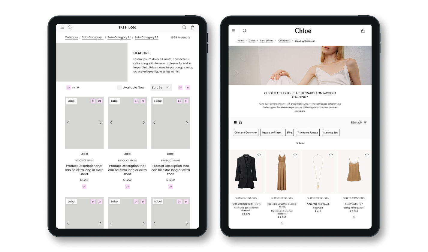
The redesigned styleguide, the enhanced component-led UI kit, and the optimised page set went live across all three design batches, each one reviewed and signed off by Chloé at a client checkpoint. The UI kit in particular was validated as a proof of concept for how future features would be built, not just a one-off deliverable.

The final shipped, component-led UI kit

What the work was designed to move

Each redesigned journey mapped to one of the four target areas above. Search and navigation changes were meant to be measured against search-to-PDP click-through and repeat-search rate. PDP and checkout refinements against cart-to-purchase conversion. Account flow simplification against completed-registration and repeat-login rates. The styleguide and component work against WCAG conformance scores.

Why I’d expect it to have worked

These weren’t speculative changes. They were built directly on documented UX research, and for search behavior specifically, on established e-commerce benchmarks. Search-query persistence is a well-evidenced fix for exactly the drop-off pattern our testing surfaced. That doesn’t replace real post-launch numbers, but it’s the difference between a redesign built on opinion and one built on evidence.

07What I’d Do Differently

If I ran this project again, the biggest change wouldn’t be a design decision. It would be an earlier one. I’d push, at kickoff, to define the north-star metrics for each journey and get instrumentation agreed before batch one shipped, not after. We had strong qualitative signal on what was broken, but no shared measurement plan for proving the fix worked, which meant that months later, in a room being asked what the impact was, my honest answer was a design rationale instead of a number. That’s a gap I’d close at the start of the next project, not the end.

I’d also try to negotiate the 70/30 split itself earlier and more explicitly, asking not just what we could redesign, but what the cost, in user friction, of the 70% we weren’t touching actually was, so scope conversations were grounded in the same research evidence as the design decisions.

08Key Takeaways

This project reinforced something I now treat as non-negotiable: user research only creates value if it’s paired with a way to prove the fix worked. Accessibility and sustainability guidelines are easiest to build in when they’re part of the design system from day one, not retrofitted later. And on a shared platform serving multiple brands, the real design skill isn’t just solving the UX problem. It’s knowing which battles, brand identity, platform constraints, scope, are worth spending stakeholder trust on, and which aren’t.

next project moody’s →